February 21, 2015Comments are off for this post.

PROCESS / CATCH KID

CatchKid-Drafts

Like I said, I'm in the midst of a handful of projects right now. All of them neither at their beginning nor quite finished... That is until today! This past week, I finalized a logo for a friend's band just in time for them to play a major show with Aaron Carter in a few weeks.

Yes, THEE Aaron Carter.

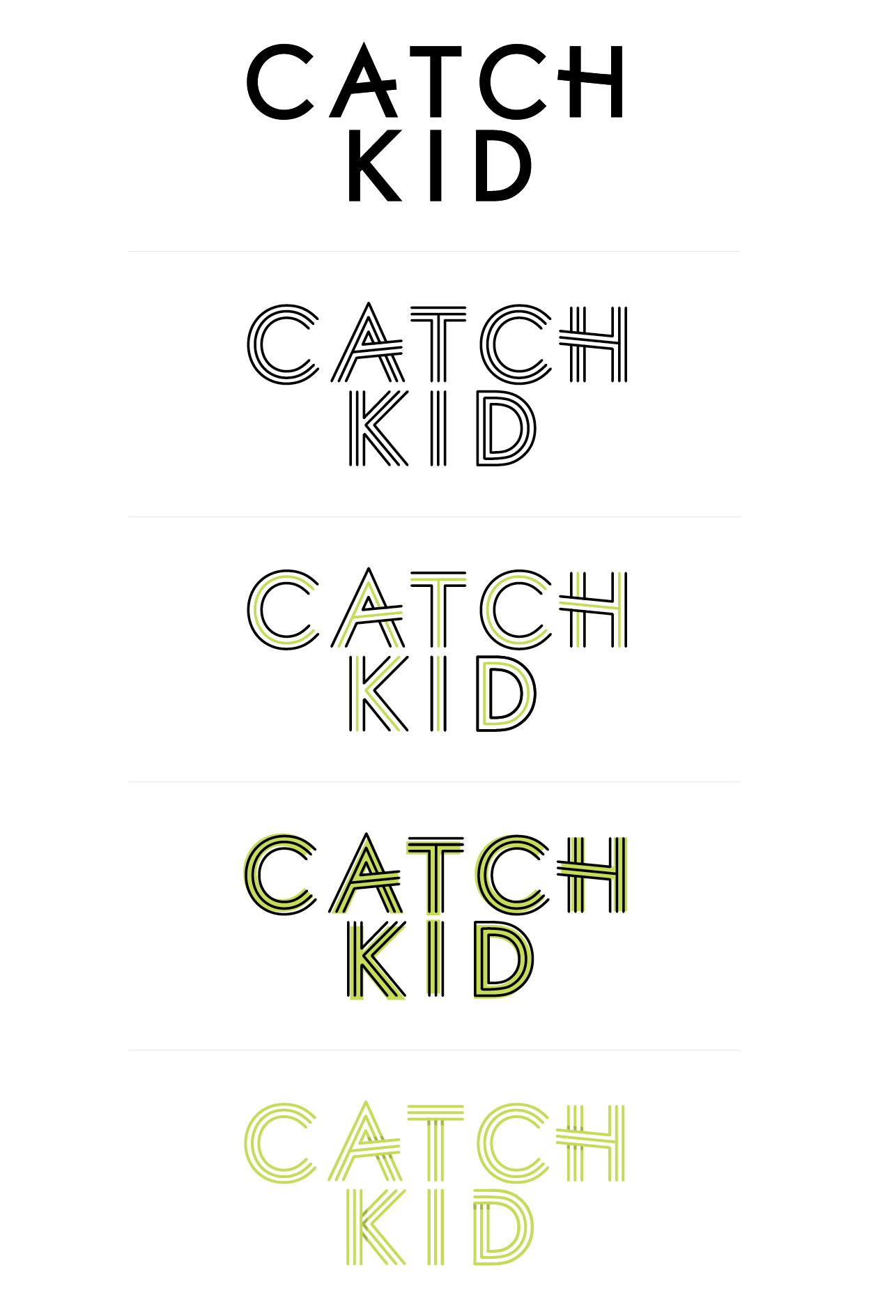
Anyways—spoiler!—this is not the final logo. But I do love how these iterations of Catch Kid reveal a bit about my process. I'm always fascinated by the less glamorous side of design—the sketches, rejected drafts, ideas gone wrong—so I thought I'd show you a bit of that today. For these drafts, I started with Futura, then made different modifications with angles, line, color and shadow. I played around with some new-to-me techniques ( which I find is the best way I learn ) and enjoyed the process of learning, experimenting + creating.

So no, none of these logos were chosen, but the concept is still one of my favorites.

And now, only 12 days until Catch Kid + Aaron's Party ( Come Get It )! The 15-year-old in me could not be more excited.

September 4, 2014Comments are off for this post.

PROCESS / 02

SA-Moodboard

If we're doing a round of #truththursdays here, I must admit I haven't always been the designer I want to be. One of my big mistakes : working harder, not smarter.

It's just one of the many things I've effed up since I started freelancing for myself more than a year ago ( another post I plan on writing soon ). I'm constantly making mistakes and learning from them. One of the best things I can do through that process is be my own best friend and strive try to do better next time. Which is why I've been buying blood orange sorbet ( check on self-BFF status! ), and working towards building a better design process workflow for my clients.

One simple way I have started to do this is with moodboards.

Moodboards are an easy beginning step in the relationship between designer + client to ensure both parties are on the same page. It's a small collection of images, typography, color and other inspiration that sets the tone for the branding or project at hand. The designer shows the client they get what he/she is looking for, and the client is reassured the designer understands their aesthetic. It can go a long way in ameliorating conflicts down the line.

This moodboard is for a current client of mine—two sisters passionate about bringing all-natural skin care + beauty products to the masses. The look is equal parts organic, modern + cool. And I'm happy to report they loved the moodboard + wanted it printed out for their wall ( me too! ).

So what did we learn today, kids? Smarter, not harder. Be your own BFF. Moodboards...always moodboards.

August 5, 2014Comments are off for this post.

PROCESS / THIS IS SINGLE

This-Is-Single-First-Drafts
Before I left for Europe, I busted my buns to finish all my freelance projects so I could blissfully enjoy my two-week vacation. While I'd like to give credit to my mad work skillz for accomplishing that, it was actually because I had awesome clients who gave pointed feedback + made designing for them super easy. Case in point : this project.

A popular food blogger came to me looking for a logo for a new venture she is starting. She was extremely focused in her vision—asking that the design be clean, simple and black + white to appeal to a wide audience. When I hear the words clean and simple, I immediately know the typography has to be extra strong in order to create a design that looks thoughtful + complete. To start, I played around with hand-lettering using ink + a brush ( seen in the first and last logos ), then ventured into Illustrator where I headed back to basics and played with shapes, rules and strong sans serif typefaces. The result is this collection of first round logo drafts.

It just so happens she picked TWO of these logos, which we tweaked to make them more cohesive so she can employ either one for her project. Now I am totally into designing simply : black + white, strong typography, minimal decoration. I believe it was Albert Einstein who said, "Make things as simple as possible, but not simpler."

Word up Einstein.