October 16, 2015Comments are off for this post.

Minimalist Baker Cookbook

MB-Cookbook-BLOG

I'm so excited to share a project I've been working on for a looonggg time: A COOKBOOK!

But not just any cookbook—I'm talking about Everyday Cooking from the babes behind Minimalist Baker ( that's you two, Dana + John ). Late last year, Dana + John asked me if I'd be interested in designing their print cookbook, and I legit didn't have to think about my answer before these words came spewing out of my mouth.

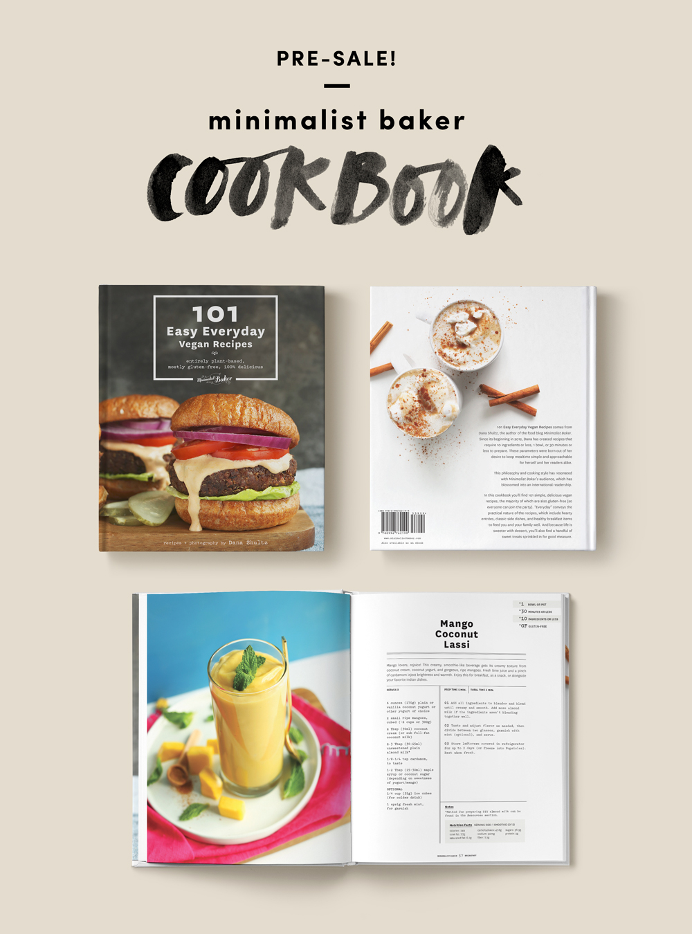
The work Dana + John put into this cookbook is visibly apparent. It's 300+ pages of simple, plant-based recipes, and helpful tips to feed you and your family well. The photography is gorgeous, the plant-based recipes are killer, and most of all, this book is approachable to EVERYONE, vegan or not. My mouth can personally vouch for the Thai Quinoa Meatballs + Peanut Sauce, Roasted Red Pepper + Harissa Hummus and The Trashy Vegan Sandwich.

And, I oh-so-hope you love the design. The overall vibe is clean, graphic + modern, with some fun touches of quirkiness throughout the book. Plus, we worked hard on layout and labeling systems for each recipe, so it's easy to navigate each section, get the nutrition facts and find gluten-free options ( 30 minutes or less, 10 ingredients or less + 1-bowl labels, also included ).

The pre-sale is on, so pre-order now to reserve your copy! We're working on finishing last-minute things on our end to ensure the book that's delivered to your door come February is equal parts useful, beautiful + mothereffing delicious.

September 8, 2015Comments are off for this post.

C + C

Earlier this year, I had the pleasure of working with a couple who have serious style + killer taste. They also happen to be my friends ( because style + taste are my two friendship pre-requisites ).

Before I left my job to go back to design school, I worked with Chris for several years, and since then, he's become a dear friend of mine. In fact, he has me to thank for his marriage to Cecilia, because without the necessary prodding of myself + our other co-worker, he may not have had the balls to ask her on a second date. Chris, YOU'RE WELCOME.

I absolutely loved working on their simple + modern 4-piece wedding invitation suite. Throughout the design process, I kept referring to J.Crew catalogs for inspiration because they encapsulated everything I wanted this suite to feel—classic and understated, elegant yet unique. We ended up choosing a navy blue + gold palette, and added lots of subtle accents, including edge painting the invitations gold ( see here ). The calligraphy took me many attempts to nail, but I love the way the lilting letterforms add a bit of quirkiness.

To finish, I letterpress-printed the suite on a C + P machine on super thick ecru Crane's lettra paper, then Cecilia's mom made the liners for those gorgeous navy blue envelopes. The full wedding suite should be revealed in my needs-to-be-updated portfolio soon.

Also, I photographed their wedding reception!

Here's a small snippet of the lively, laugh-filled + joyous evening. So much love for these two.

CCWedding2015-010_1CCWedding2015-013_1CCWedding2015-027_1CCWedding2015-035_1CCWedding2015-052_1CCWedding2015-059_1CCWedding2015-089_1CCWedding2015-095_1CCWedding2015-003_1CCWedding2015-098_1CCWedding2015-001_1 CCWedding2015-146_1 CCWedding2015-144_1CCWedding2015-101_1CCWedding2015-186_1CCWedding2015-168_1 CCWedding2015-190_1CCWedding2015-211_1CCWedding2015-195_1 CCWedding2015-217_1 CCWedding2015-229_1 CCWedding2015-233_1 CCWedding2015-244_1 CCWedding2015-255_1 CCWedding2015-269_1CCWedding2015-324_1CCWedding2015-320_1 CCWedding2015-331_1 CCWedding2015-378_1 CCWedding2015-369_1CCWedding2015-341_1 CCWedding2015-348_1CCWedding2015-402_1 CCWedding2015-406_1 CCWedding2015-410_1 CCWedding2015-428_1 CCWedding2015-441_1 CCWedding2015-454_1

June 28, 2015Comments are off for this post.

PROCESS / Castle & Coal

I'm a wee bit behind on showing new design work, but that's about to change right now folks. Earlier this year, the Madison-based team over at Castle and Coal were in need of branding for their new men's clothing store. C + C sells a curated collection of vintage-inspired clothing that's both modern and masculine. They've got a "slow fashion" ethos—focusing on well-made, high-quality clothes that last. As you can imagine, I was so excited to take this project on.

Local business, thoughtful men's fashion, vintage-y style, SOLD.

Above are a few first round logo drafts initially sent over to the C + C team. Each draft utilizes a neutral color palette of charcoal gray, light gray + mustard-y gold along with some vintage wood cut illustrations. I tried to keep an industrial yet classic aesthetic with a nice variety of elements that can be mix and matched together. Branding new businesses, I think it's important to have a strong yet flexible identity system that can be easily deployed for whatever is needed.

The final C + C logo is a mixture of the above designs ( hint, hint: we settled on a hand-lettered version ). I can't wait to reveal the full project very soon—business cards, hang tags and store signage included. All in due time my friends, all in due time.