September 8, 2015Comments are off for this post.

C + C

Earlier this year, I had the pleasure of working with a couple who have serious style + killer taste. They also happen to be my friends ( because style + taste are my two friendship pre-requisites ).

Before I left my job to go back to design school, I worked with Chris for several years, and since then, he's become a dear friend of mine. In fact, he has me to thank for his marriage to Cecilia, because without the necessary prodding of myself + our other co-worker, he may not have had the balls to ask her on a second date. Chris, YOU'RE WELCOME.

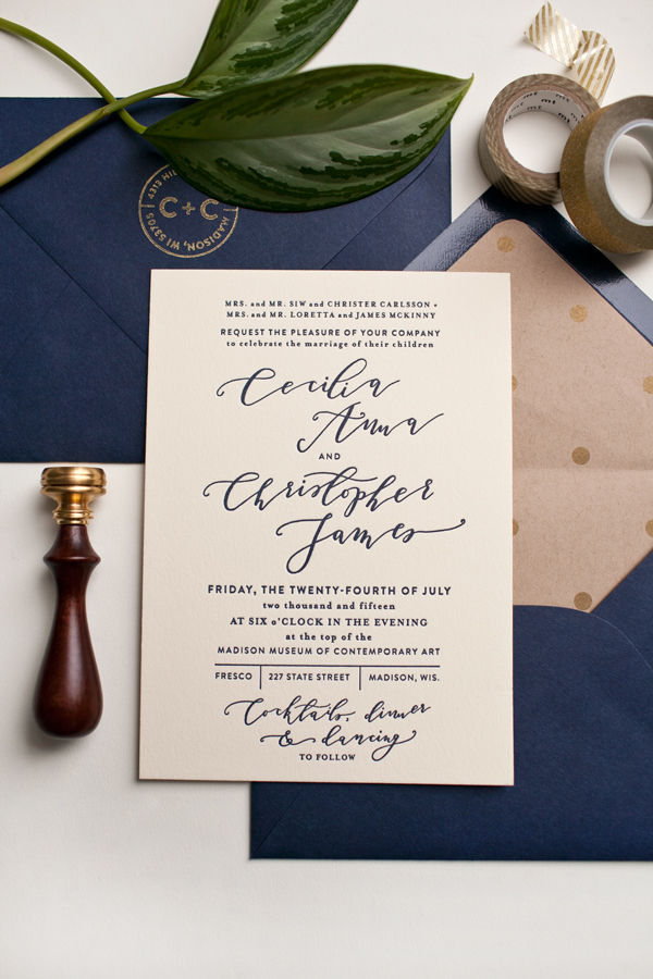
I absolutely loved working on their simple + modern 4-piece wedding invitation suite. Throughout the design process, I kept referring to J.Crew catalogs for inspiration because they encapsulated everything I wanted this suite to feel—classic and understated, elegant yet unique. We ended up choosing a navy blue + gold palette, and added lots of subtle accents, including edge painting the invitations gold ( see here ). The calligraphy took me many attempts to nail, but I love the way the lilting letterforms add a bit of quirkiness.

To finish, I letterpress-printed the suite on a C + P machine on super thick ecru Crane's lettra paper, then Cecilia's mom made the liners for those gorgeous navy blue envelopes. The full wedding suite should be revealed in my needs-to-be-updated portfolio soon.

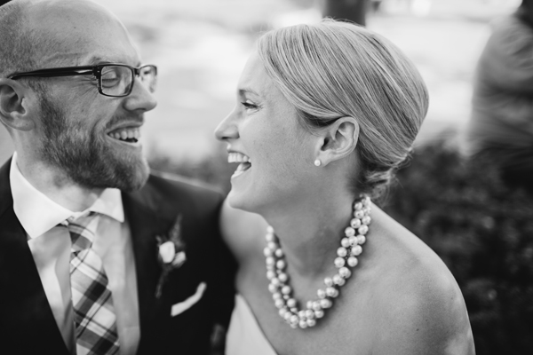
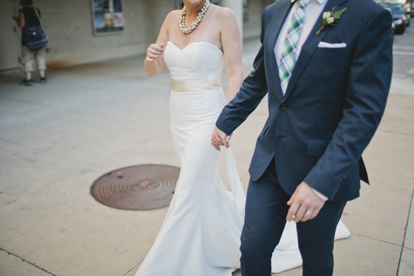
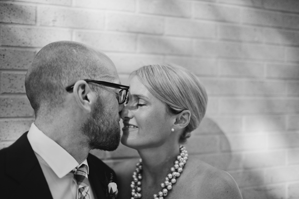
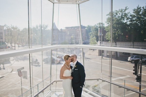
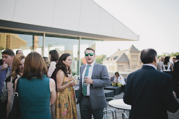
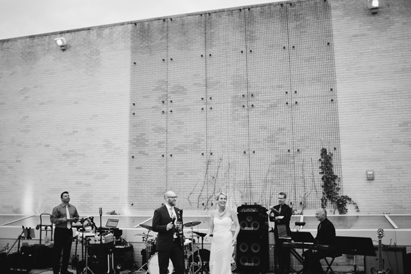
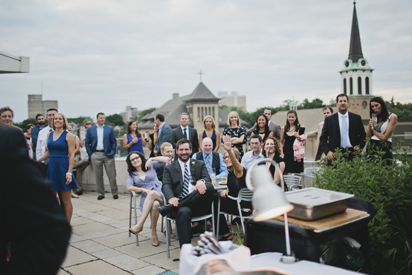
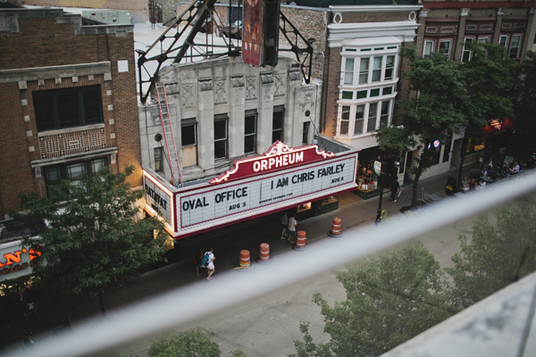
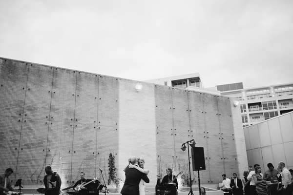
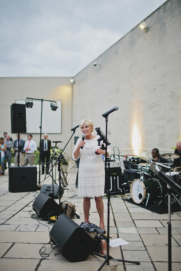
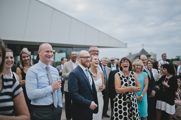
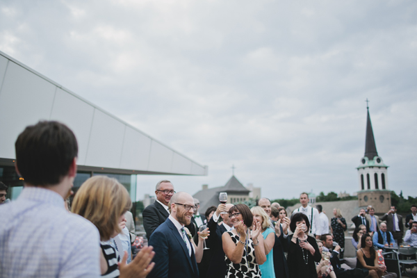
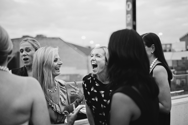
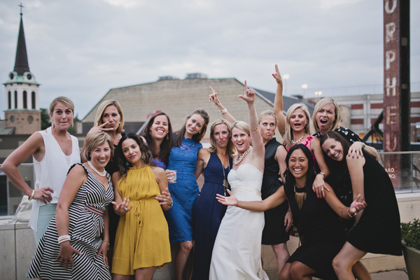
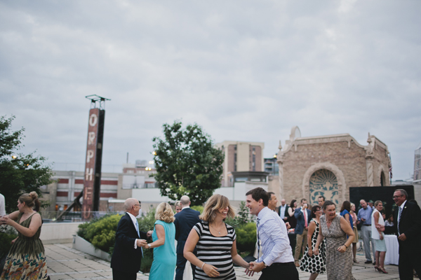
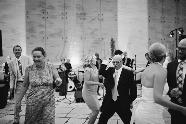
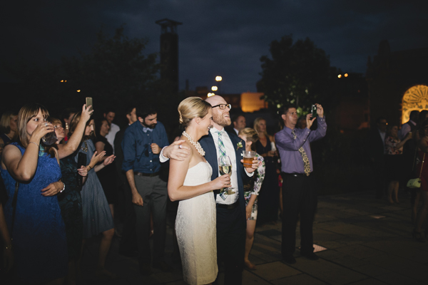
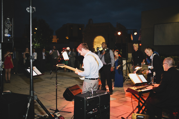
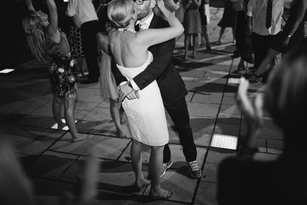
Also, I photographed their wedding reception!

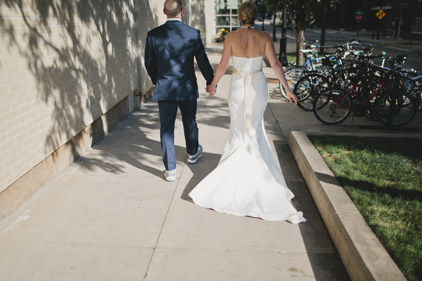
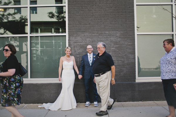
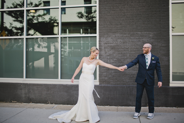
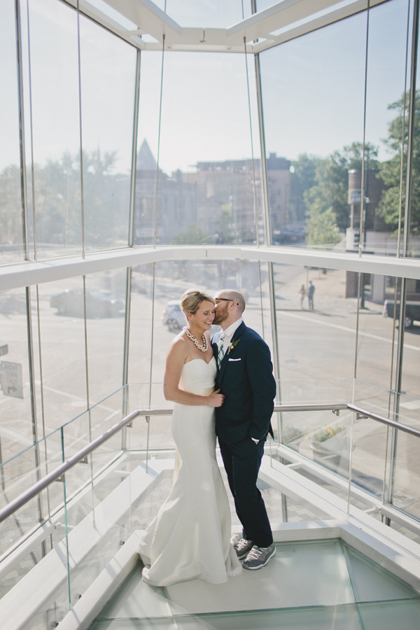
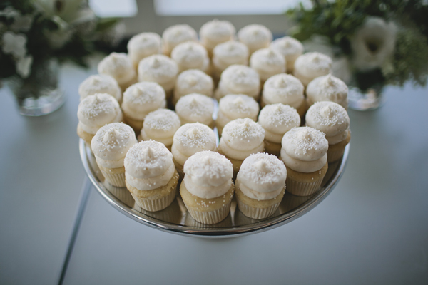
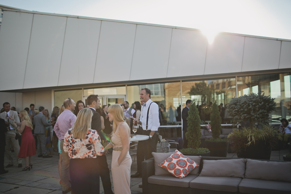
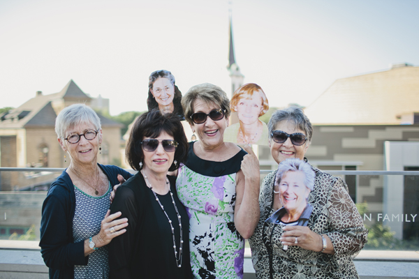
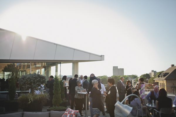
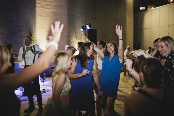
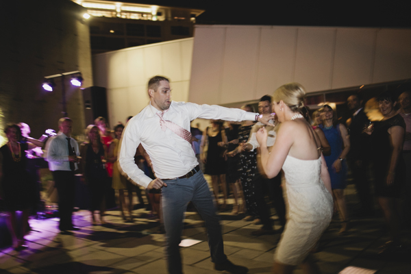
Here's a small snippet of the lively, laugh-filled + joyous evening. So much love for these two.

CCWedding2015-010_1CCWedding2015-013_1CCWedding2015-027_1CCWedding2015-035_1CCWedding2015-052_1CCWedding2015-059_1CCWedding2015-089_1CCWedding2015-095_1CCWedding2015-003_1CCWedding2015-098_1CCWedding2015-001_1 CCWedding2015-146_1 CCWedding2015-144_1CCWedding2015-101_1CCWedding2015-186_1CCWedding2015-168_1 CCWedding2015-190_1CCWedding2015-211_1CCWedding2015-195_1 CCWedding2015-217_1 CCWedding2015-229_1 CCWedding2015-233_1 CCWedding2015-244_1 CCWedding2015-255_1 CCWedding2015-269_1CCWedding2015-324_1CCWedding2015-320_1 CCWedding2015-331_1 CCWedding2015-378_1 CCWedding2015-369_1CCWedding2015-341_1 CCWedding2015-348_1CCWedding2015-402_1 CCWedding2015-406_1 CCWedding2015-410_1 CCWedding2015-428_1 CCWedding2015-441_1 CCWedding2015-454_1

May 6, 2015Comments are off for this post.

HAPPY MOTHER’S DAY

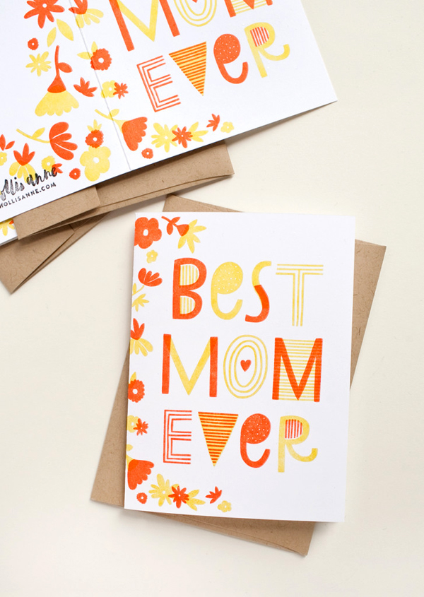
Mother's Day Card | Hollis Anne

I know it's a few days early, but it's only fair all the mamas out there get a little extra love + attention. And as a devoted daughter, what better way for me to do that than with a Mother's Day card designed in honor of my own mom? A small token to say thank you, Babs.

These two-color, letterpress printed cards came off the press last week, and—exciting news!—are being sold at a local shop called Anthology along with a few of my letterpress notepads + new projects I'm working on. If you're ever in Madison, you must stop by. Such a cute store.

Back to Mother's Day! Whether you're a new mom, work mom, grandma mom, honorary mom, cool mom or just ya know...mom, I wish you a happy Mother's Day.

And to my own mom, you really are the BEST EVER.

( *If I can ever get my act together, these cards shall be in my online shop soon. )

March 30, 2015Comments are off for this post.

MY BUSINESS CARDS

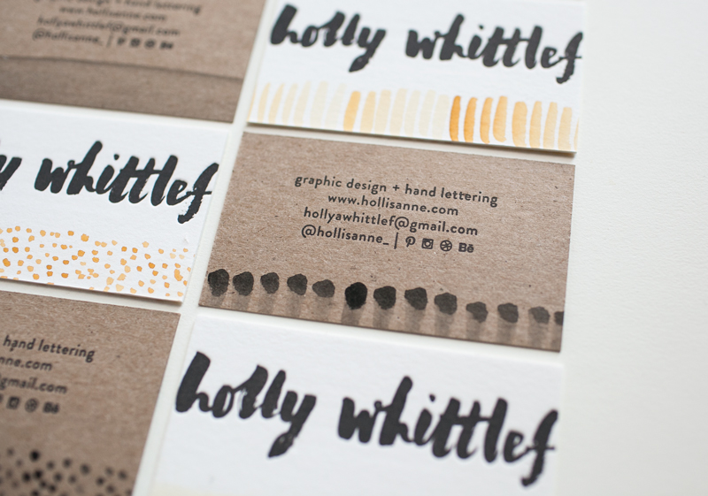
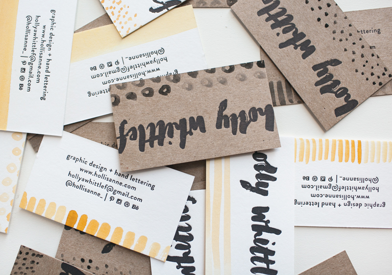
Even though I printed my business cards more than three months ago for my portfolio show, I finally got around to finishing trimming all the cards just a few weeks ago. Normally, the reason would be that I'm really good at procrastination ( usually by means of hilarious Buzzfeed articles like this ). Lately however, work has been steady + I haven't needed the cards so much.
BUT I still love these letterpress, hand-watercolored nuggets just as much as the day I printed them. It's probably because they combine all my most favorite things : letterpress, hand lettering, mustard yellow + polka dots.

These cards were letterpress printed by me on two types of paper—chipboard + a super thick white stock called Crane's Lettra. I stuck with a dark charcoal gray ink for letterpress, then added a fun, custom pattern to the bottom of each card with watercolor. That makes each card truly unique. And am I the only one who loves having different options to choose from? These cards were a huge hit at the portfolio show, which makes me believe I'm not alone in this.

Don't make me pick a favorite card, although the mustard yellow polka dot one clearly wins.

Buzzfeed even has my back on this one ( see #22 ).

HA-BizCards-03

HA-BizCards-02