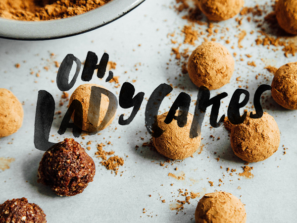
It's been awhile since I've shown any design work, but I'm happy to have FINALLY squeezed in a blog post during the crazy holiday season to show off the new Oh, Ladycakes!
When Ashlae first emailed me about designing her new logo, I was excited not only because I've been following her blog for a long time and want to eat every single vegan thing she makes, but because the lady has serious style. As evidenced by her drop dead amazing wedding dress ( le swoon ), Ashlae has impeccable taste. She's also sassy, wicked smart and an avid traveler, so I had a sneaky feeling we'd get along just fine.
Over the past few months, we've been working on this hand-lettered logo to show off her new website ( developed by Alex, with some styling help from me ). The final result is clean + modern, yet quirky + stylish... and I LOVE IT. Then we spent hours texting back and forth about typeface choices for the website, and that's when I knew I had to make her my friend IRL. I swear to you, people who care about good typography are the best kind of people.
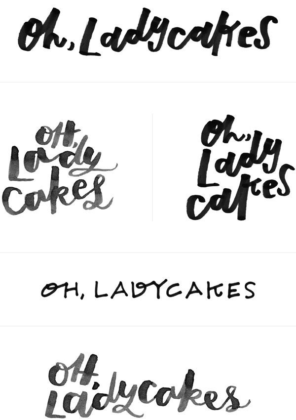
I've included a few of the logo drafts that didn't make the cut below. As you can see, we were going for hand-lettering that felt organic + quirky, but easily readable. I still love the first option below. The swoop from the d to the y, coupled with that loopy k... gah, I love letters.
top two photos by Oh, Ladycakes / bottom photo by Ali V.


